

Red: we tend to associate red with emotional extremes such as love, anger and sexuality, making it one of the most powerful, stimulating colours on the spectrum. Red also has an energising effect on us and can elicit a number of different biological responses, such as an increased metabolism, respiration rate and blood pressure.
For these reasons, we don’t often see red used that much in our homes, particularly not brighter shades. We would advise against using red in areas of your home where you want to relax, and instead use it in areas where you might work or exercise.


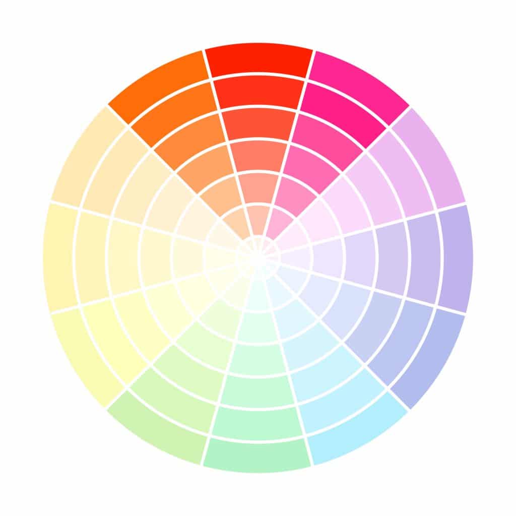
 Monochromatic:
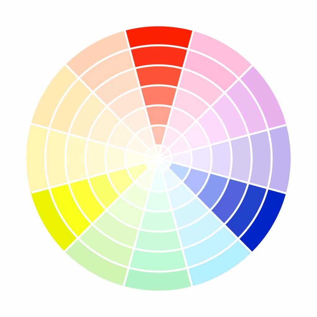